pelleaardema

May 28, 2013

Participatory Budgeting – Google Maps

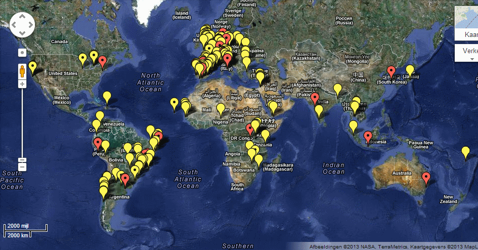
(map initiated by Tiago Peixoto http://democracyspot.net/) Participatory budgeting is a democratic process in which community members decide how to spend part of a public budget. Over […]
May 17, 2013

Global Rich List

Nice example of a visualization based on your own income data… and the aim is to seduce you to donate. Now compare it to the Dutch […]
May 10, 2013
image by http://www.flickr.com/photos/marcfonteijn/

Data visualisation experiment: the waste we produce…

I’ve just created this interactive map, based on Eurostat data, using Google Charts. This is the amount of waste in kgs per capita we produced in […]
April 26, 2013

Checkmyschool.org

Checkmyschool helps citizens in the Phillippines access information, send feedback, and resolve issues on education services. To find out more, visit the original site: Checkmyschool.org
April 10, 2013

World Bank Dataviz

The World Bank has set out to visualize the fight against poverty. They have already collected an inspiring series of visualizations on all kinds of subjects. […]
April 10, 2013

Open Data – An Introduction | Open Knowledge Foundation

What is Open Data? “Open data is data that can be freely used, reused and redistributed by anyone – subject only, at most, to the requirement […]
April 10, 2013

Sanjay Pradhan: How open data is changing international aid | Video on TED.com

How do we make sure that development and aid money actually goes to the people who most need it? Sanjay Pradhan of the World Bank Institute […]
April 3, 2013

What is big data?

90% of the data in the world today has been created in the last two years alone. This data comes from everywhere: sensors used to gather […]
March 22, 2013

The Next Big Thing

Every year at the eCampaigning Forum, a meeting for digital activists from the UK and across the world to share experience and expertise, we sit down for […]