Found on the web

August 28, 2014

How to make infographics: a beginner’s guide to data visualisation | Global-development-professionals-network | The Guardian

As a growing number of international NGOs are using infographics, charts and interactive maps to share success andhighlight disaster, how can organisations with less resources create high […]
February 26, 2014

A Map That Wasn’t a Map – Features – Source: An OpenNews project

Excellent example of a map visualization, and background info about the design choices made. To find out more, visit the original site: A Map That Wasn’t […]
November 1, 2013

Engagement Game Lab

To find out more, visit the original site: Engagement Game Lab
July 5, 2013

Datawrapper

This little tool reduces the time needed to create a correct chart and embed it into any website from hours to seconds. It makes charting easy, […]
June 26, 2013

African Bus Routes Redrawn Using Cell-Phone Data | MIT Technology Review

Researchers at IBM, using movement data collected from millions of cell-phone users in Ivory Coast in West Africa, have developed a new model for optimizing an […]
June 12, 2013

OSCity – Netherlands

OSCity (Open Source City) combines the dutch spatial planning with the newest information technology. Through direct retrieval of geographic data, direct visualization and combination, it allows […]
May 28, 2013

Participatory Budgeting – Google Maps

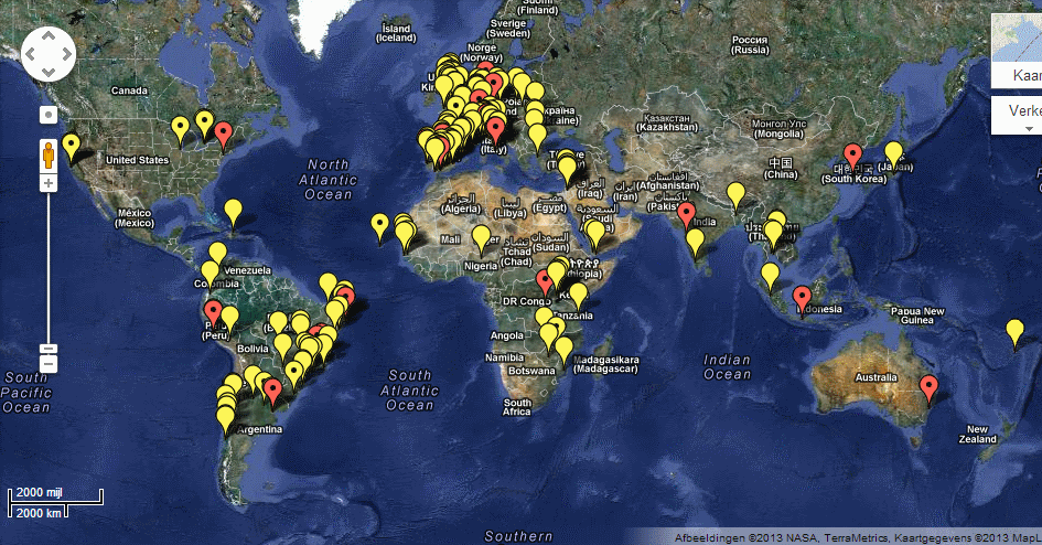
(map initiated by Tiago Peixoto http://democracyspot.net/) Participatory budgeting is a democratic process in which community members decide how to spend part of a public budget. Over […]
May 17, 2013

Global Rich List

Nice example of a visualization based on your own income data… and the aim is to seduce you to donate. Now compare it to the Dutch […]
April 26, 2013

Checkmyschool.org

Checkmyschool helps citizens in the Phillippines access information, send feedback, and resolve issues on education services. To find out more, visit the original site: Checkmyschool.org