
Data visualisation experiment: the waste we produce…
May 10, 2013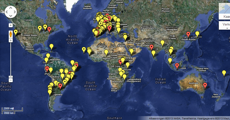
Participatory Budgeting – Google Maps
May 28, 2013Nice example of a visualization based on your own income data… and the aim is to seduce you to donate.
Now compare it to the Dutch version of the same app: http://globalrichlist.nl
Feel the difference?
To find out more, visit the original site: Global Rich List